WHAT
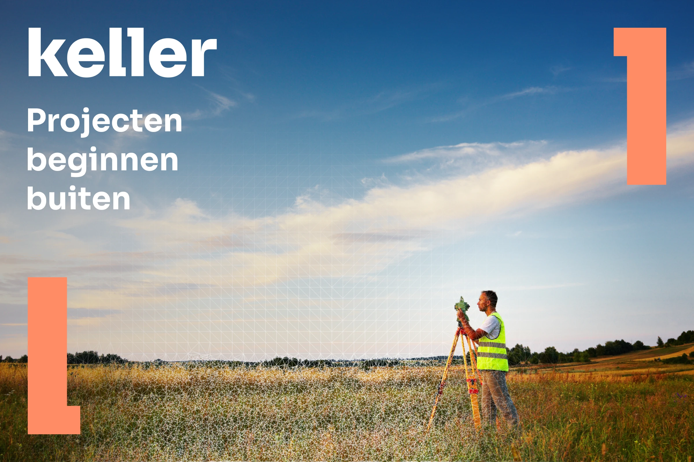
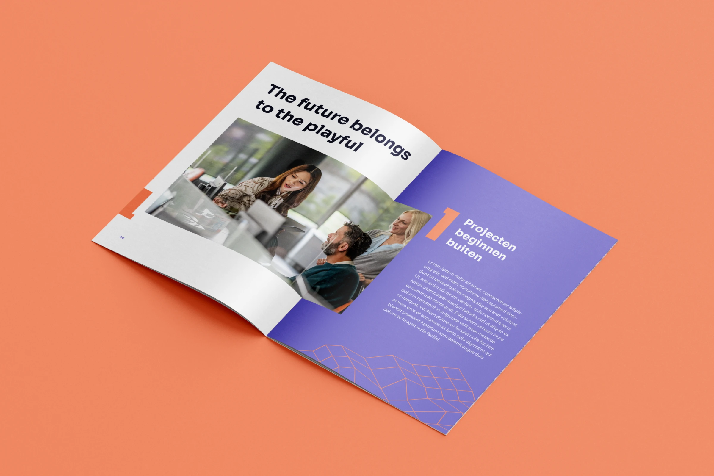
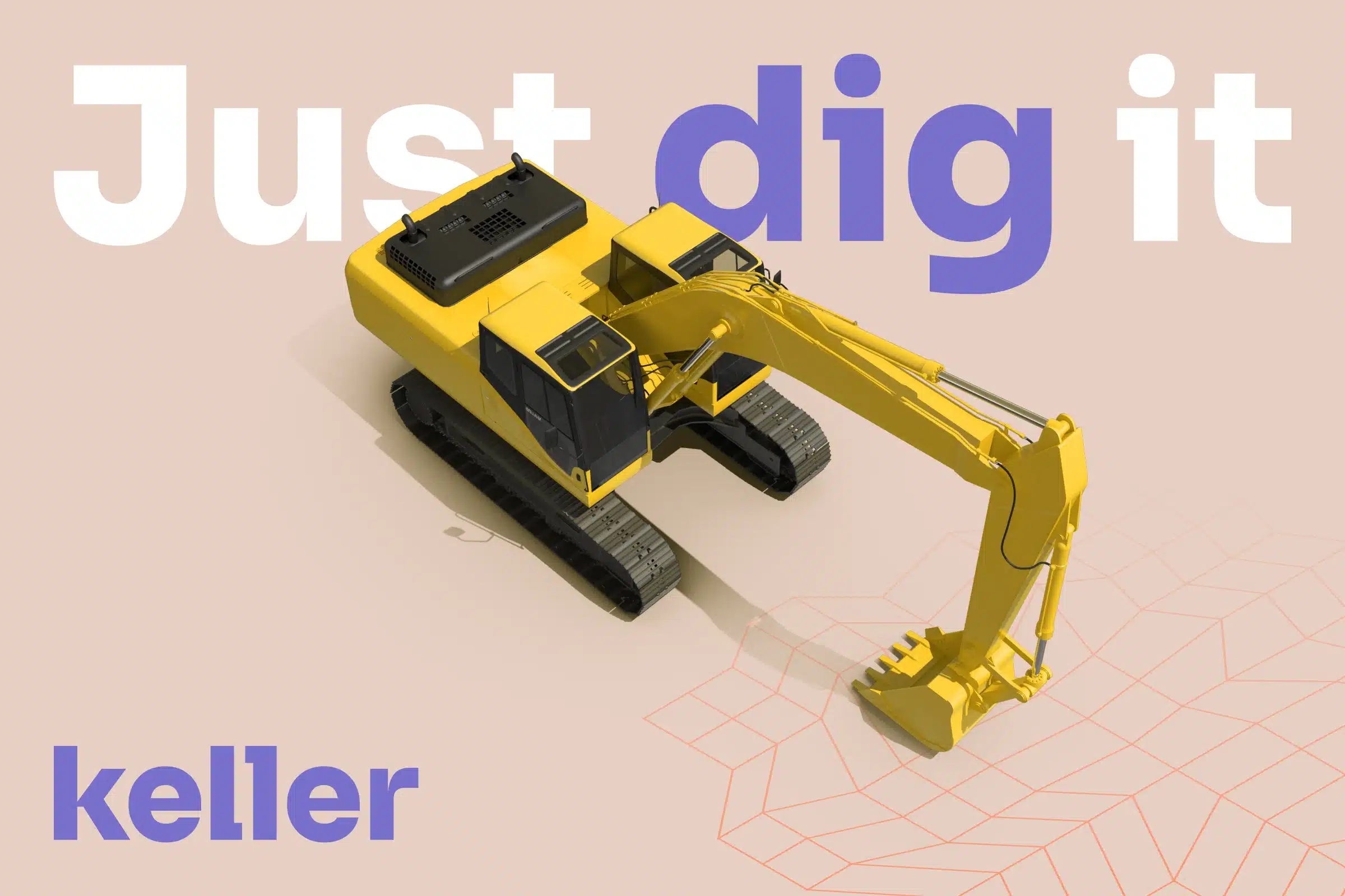
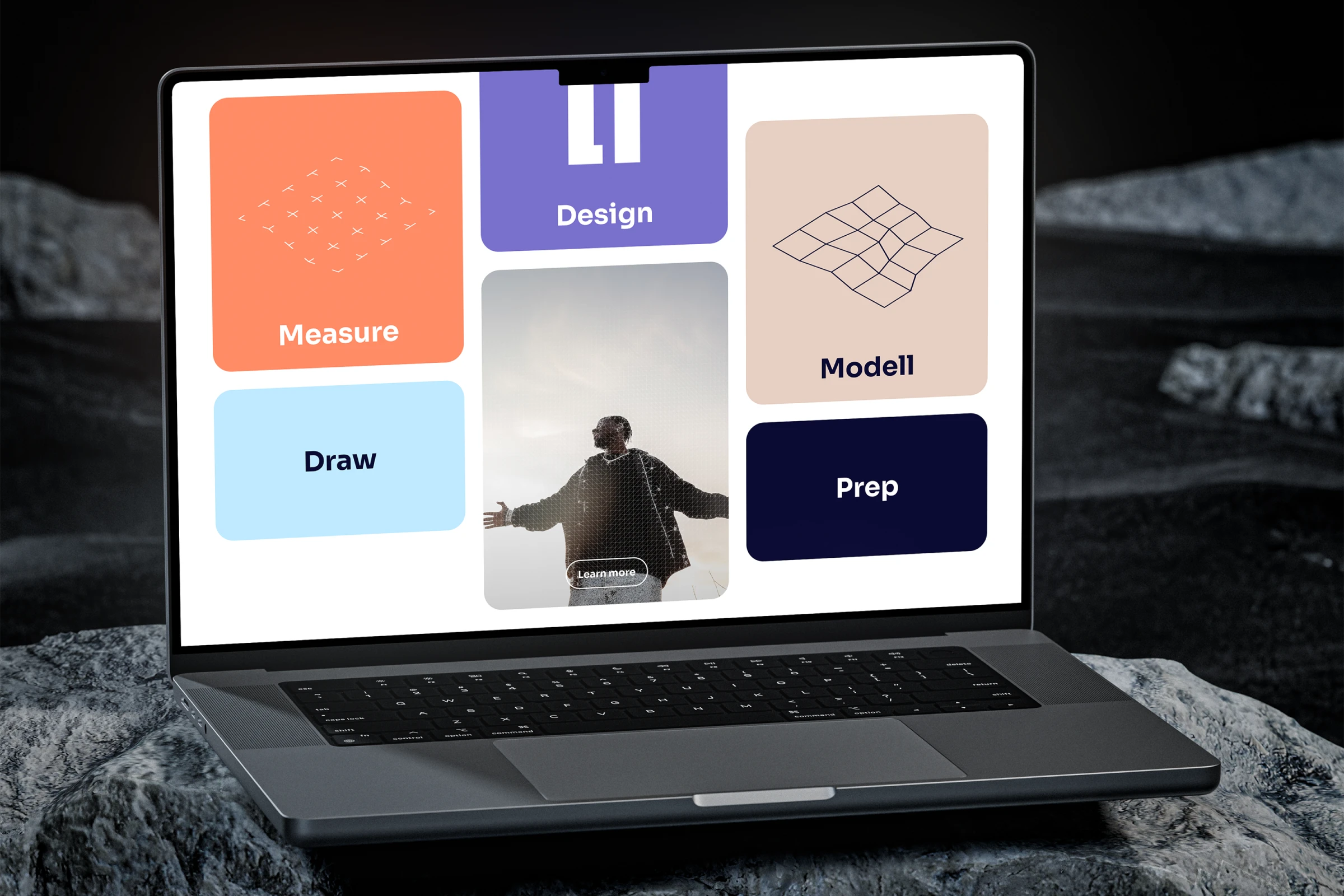
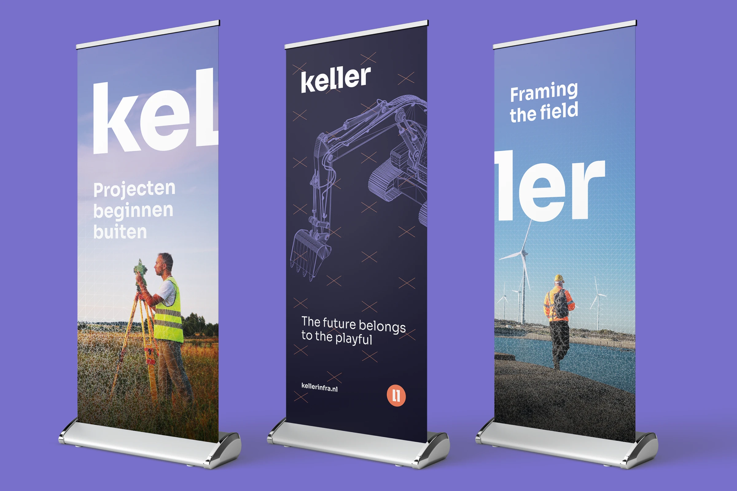
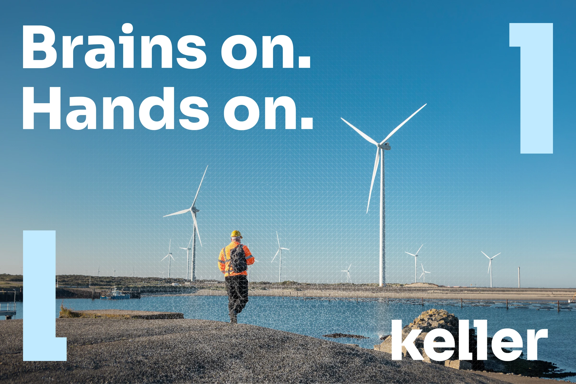
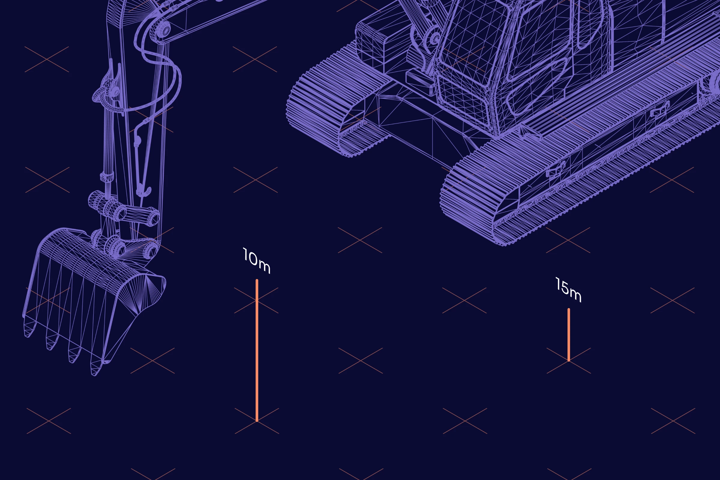
Brand identity
WHERE
WADM
ROLE
Designer
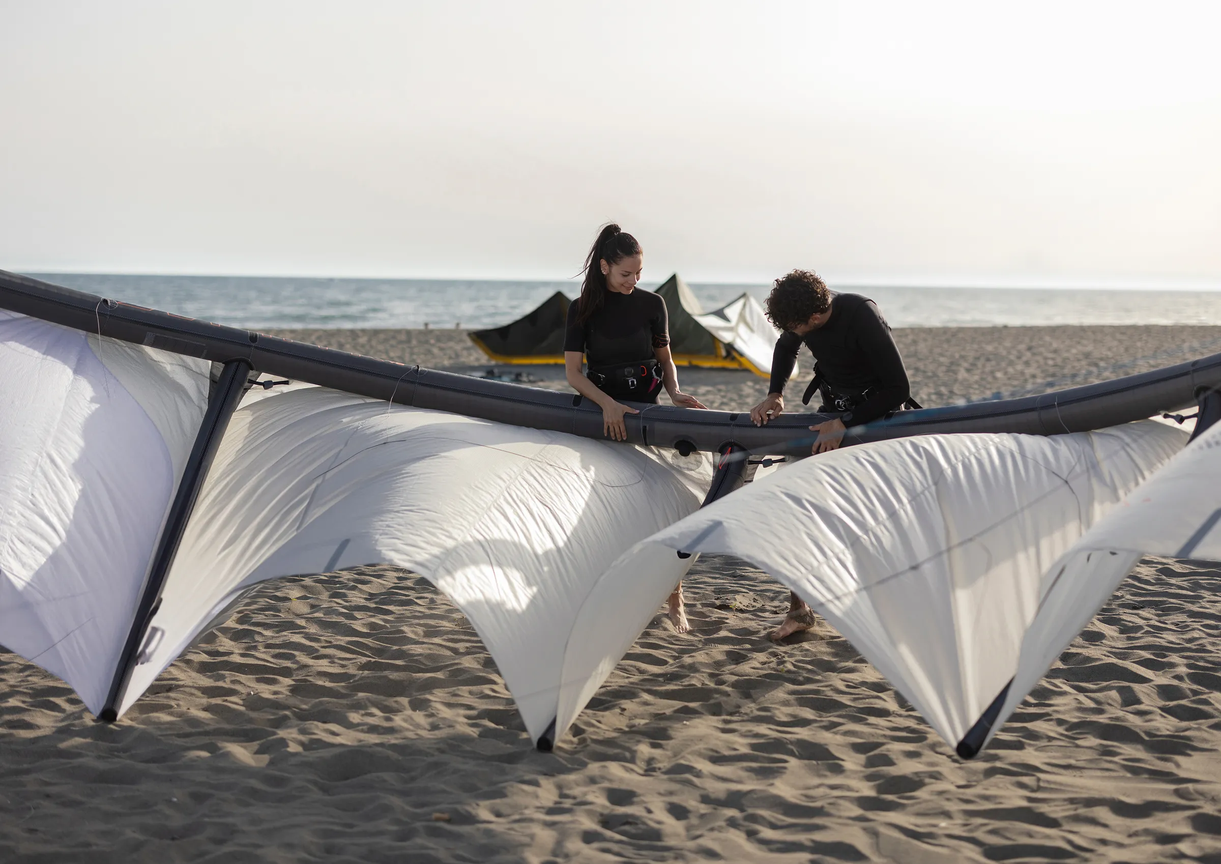
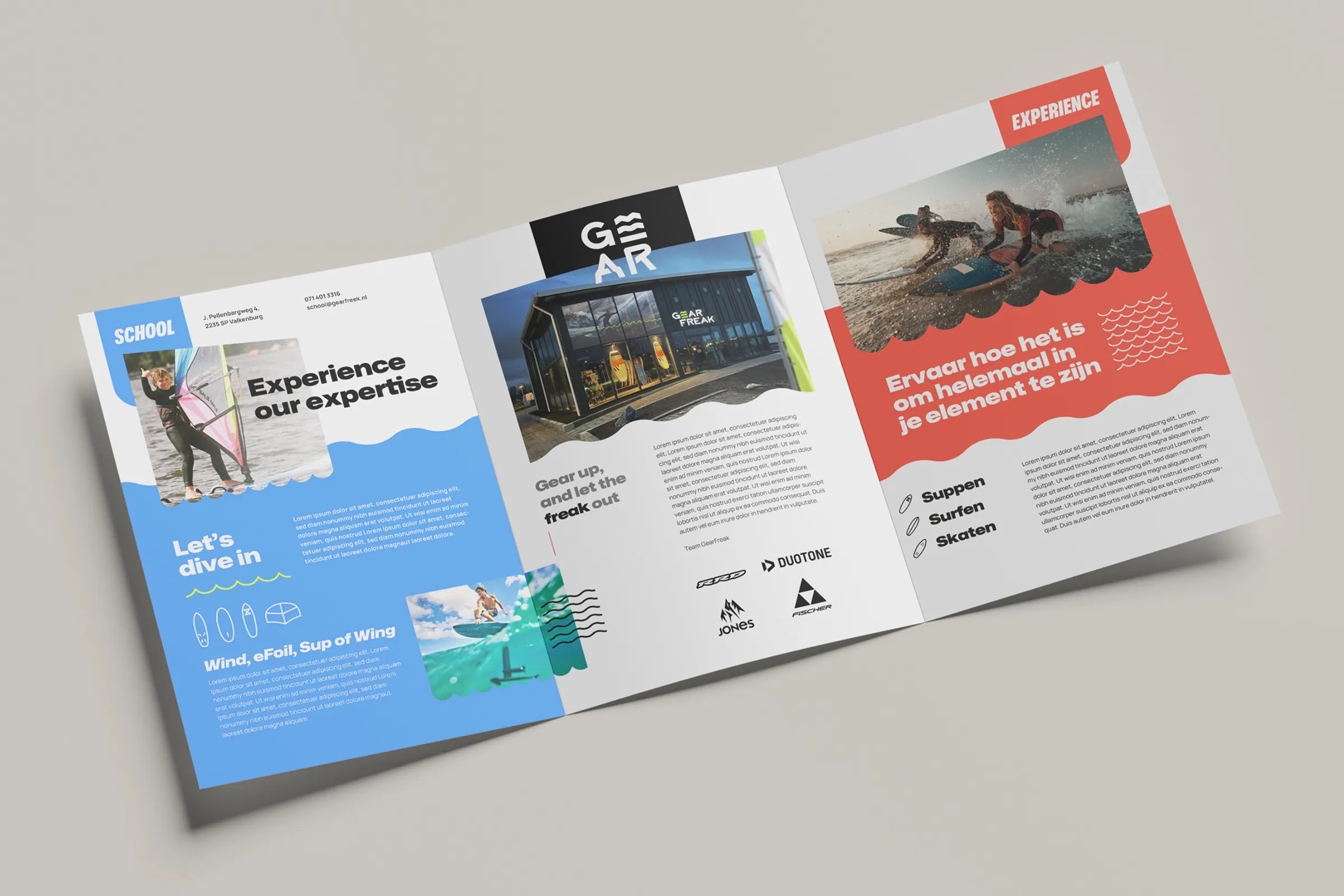
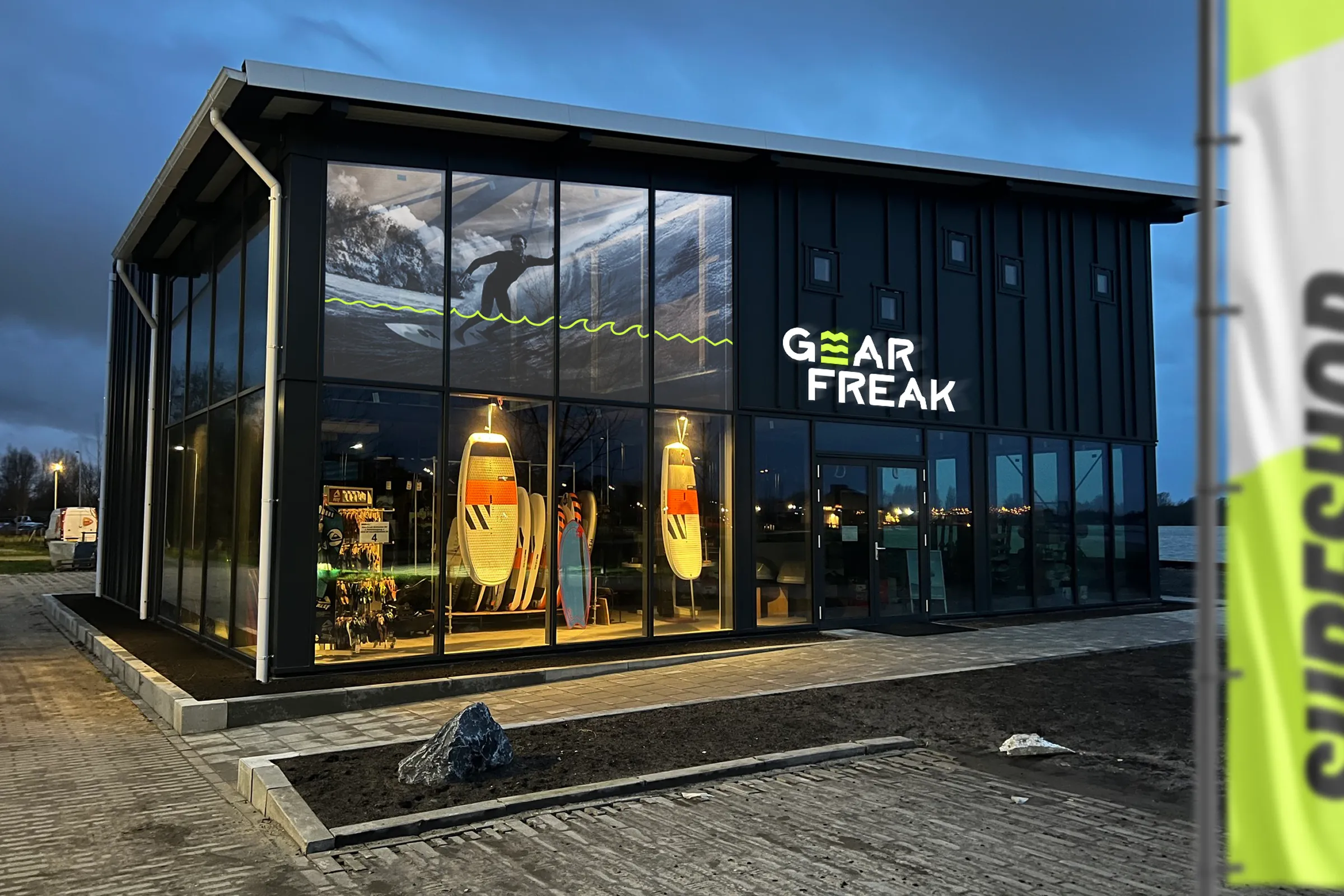
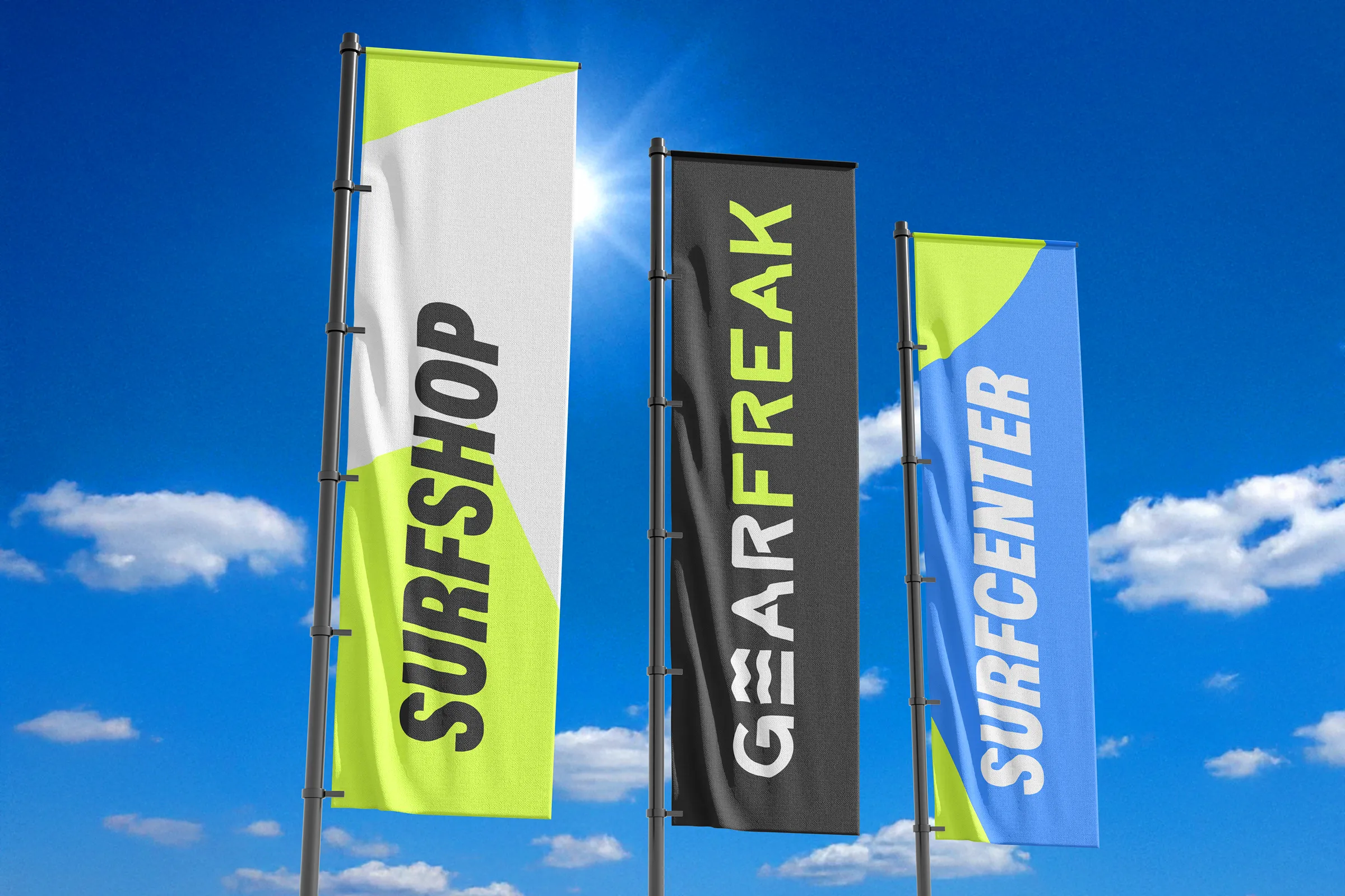
GearFreak, a surf and outdoor sports retailer, wanted to sharpen its brand to better connect its webshop, physical store, and sports clinics. Over the years, the company built a loyal local community, but its communication lacked consistency and emotional impact. Through the BrainSells® Spark program, WADM redefined the brand from the inside out—clarifying its story, personality, and positioning. The goal: strengthen the GearFreak brand experience across every touchpoint, from online shopping to hands-on lessons, and stand out in a competitive outdoor sports market.
DESIGN
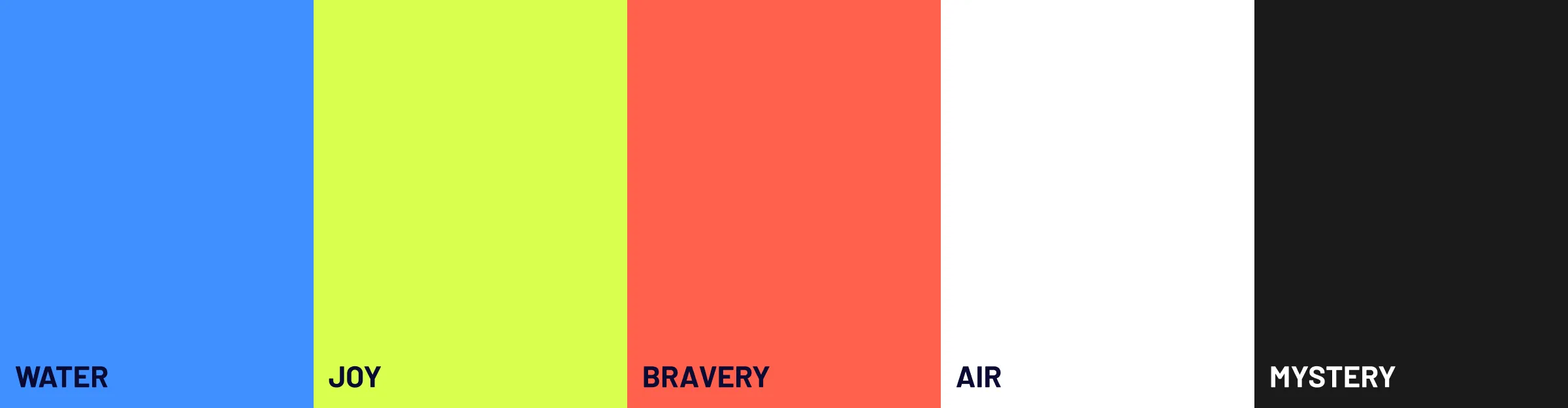
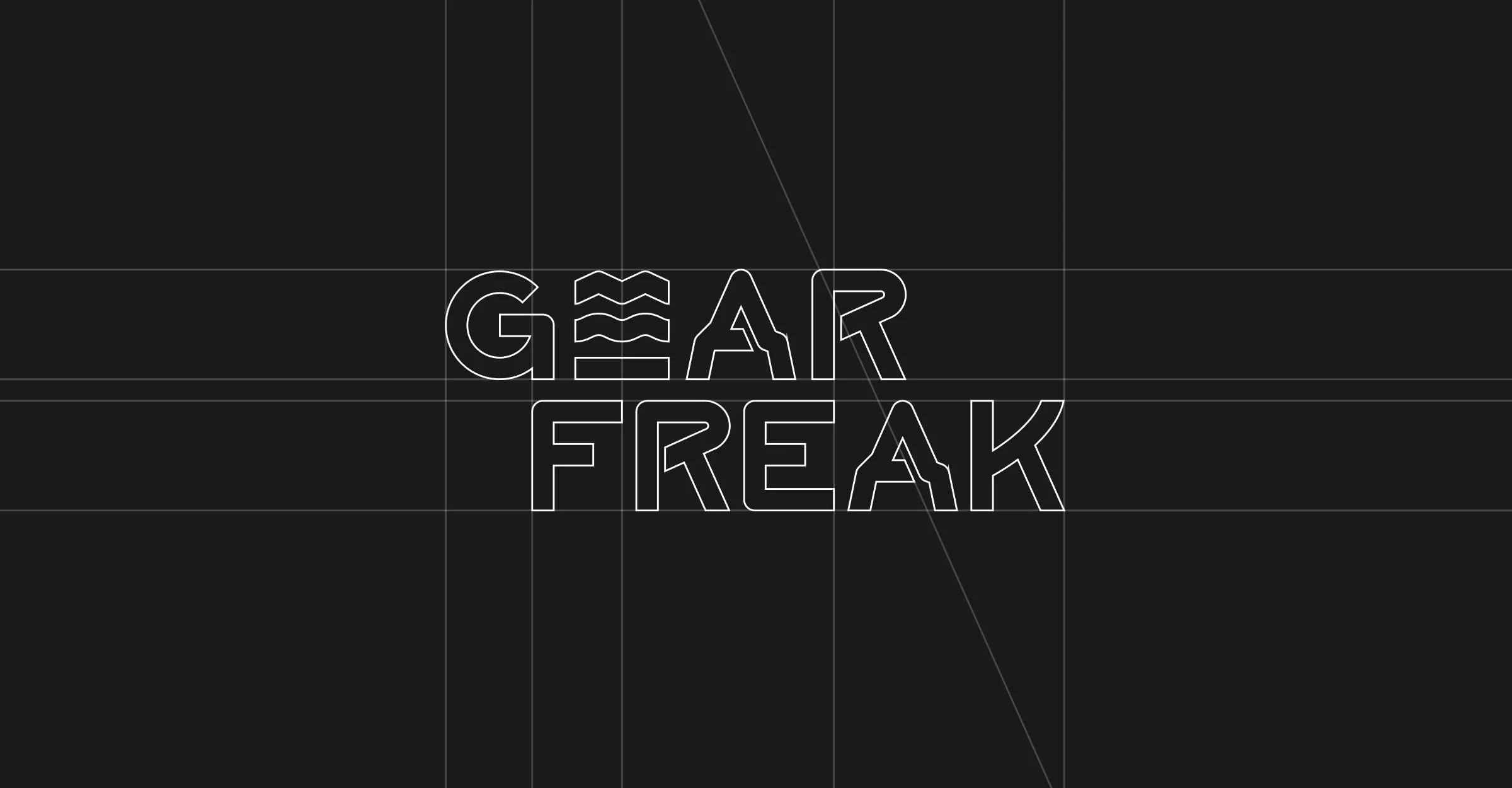
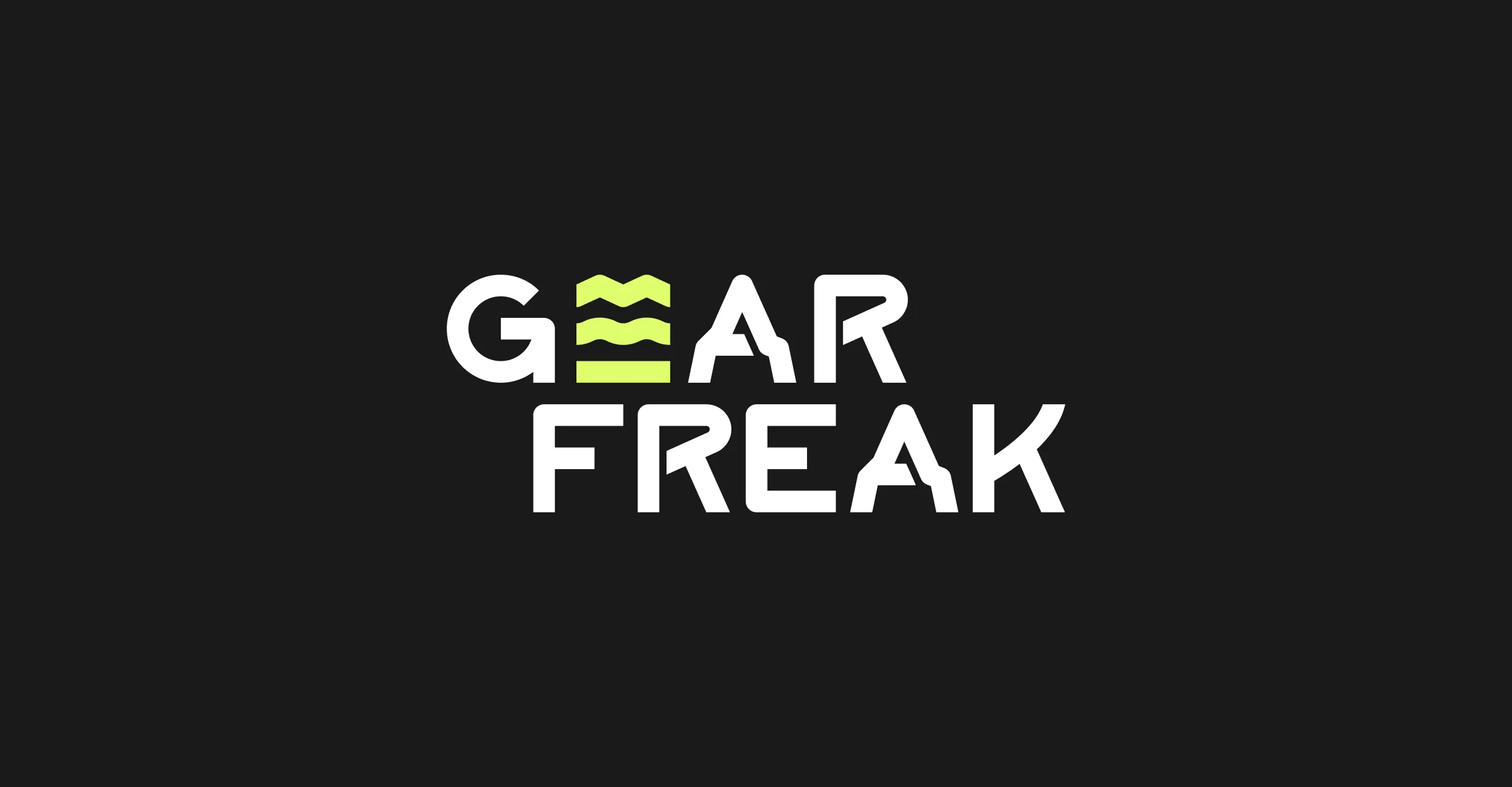
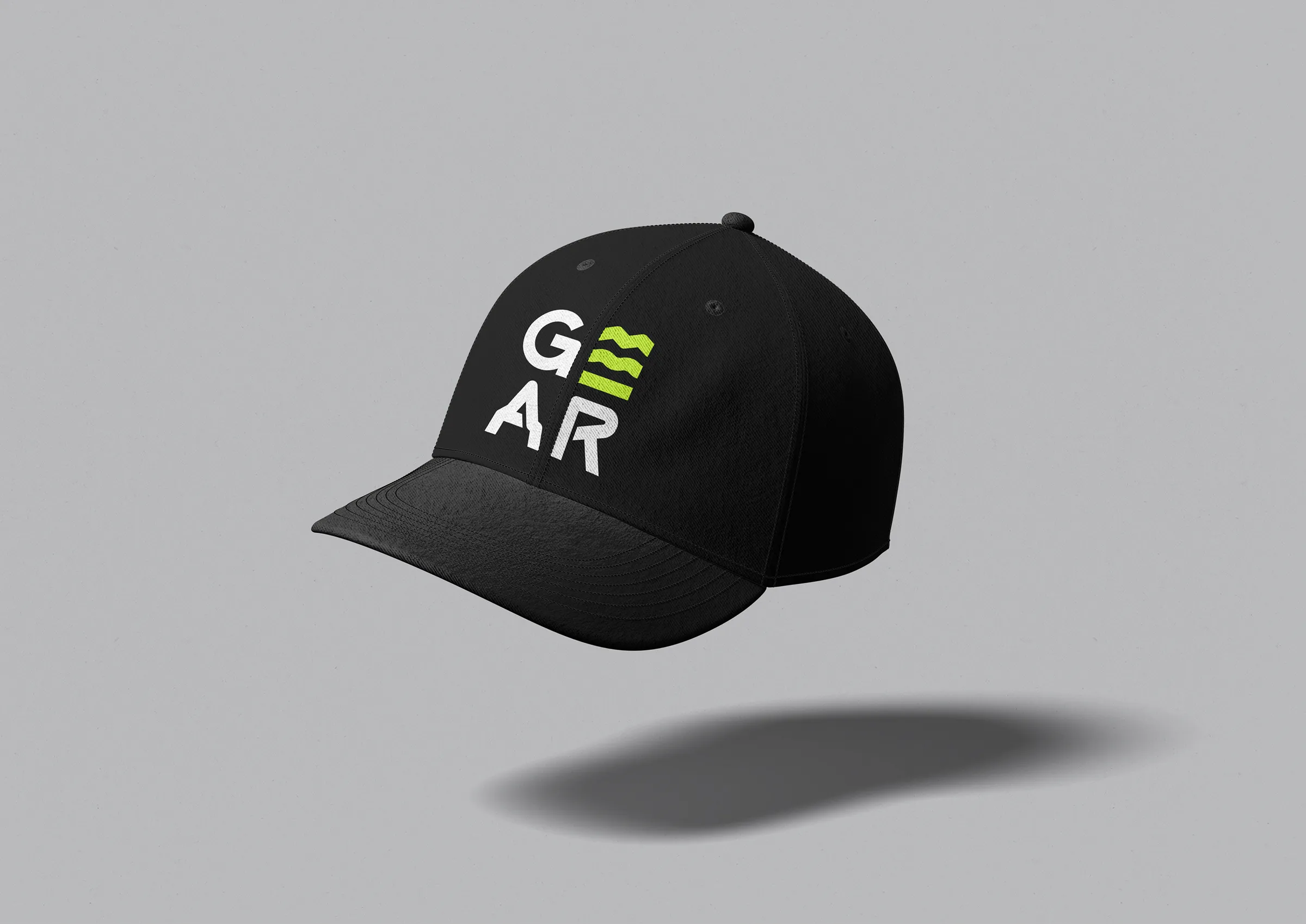
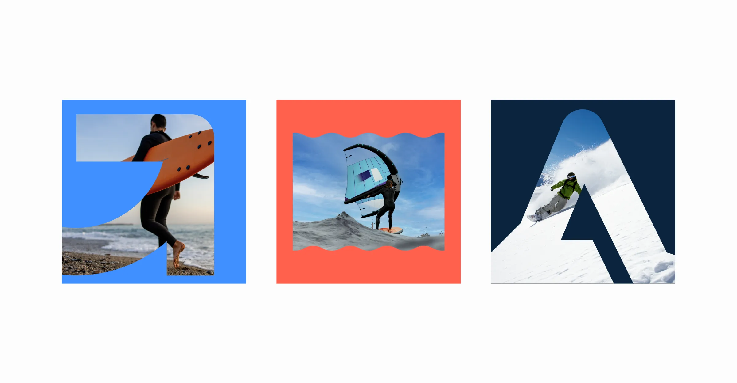
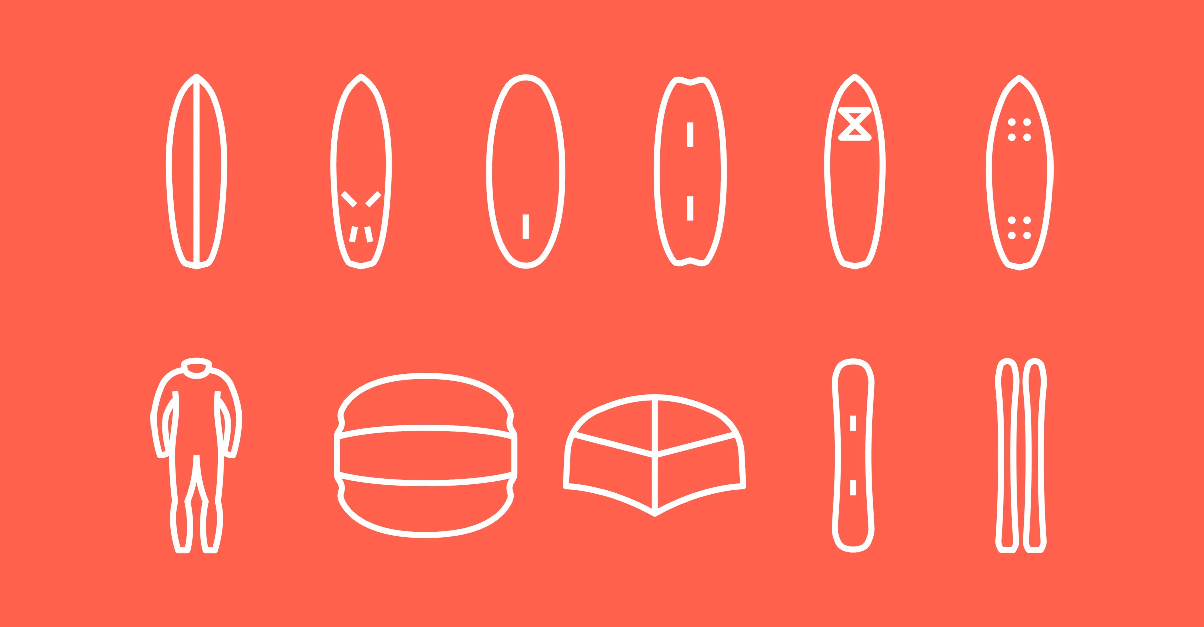
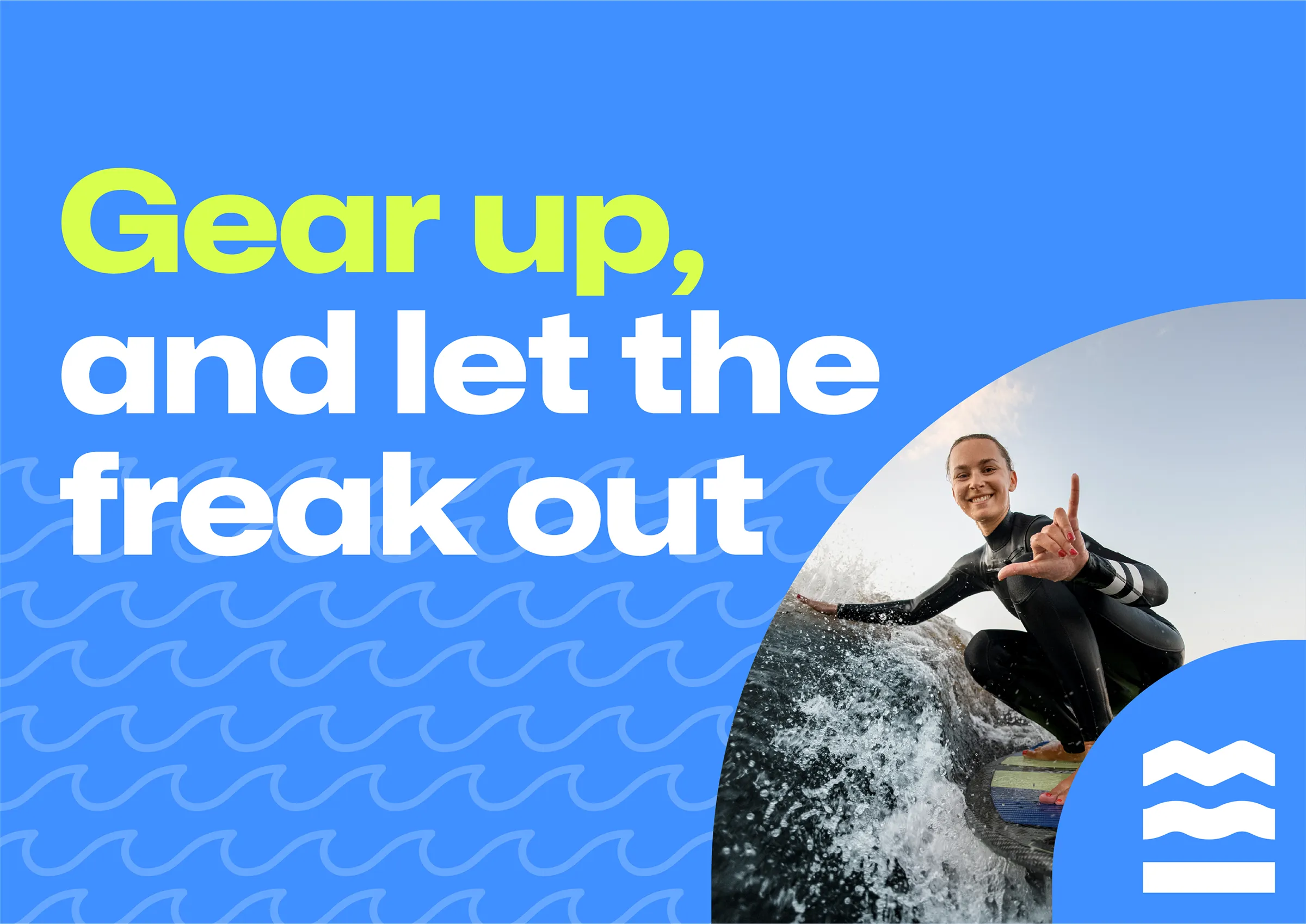
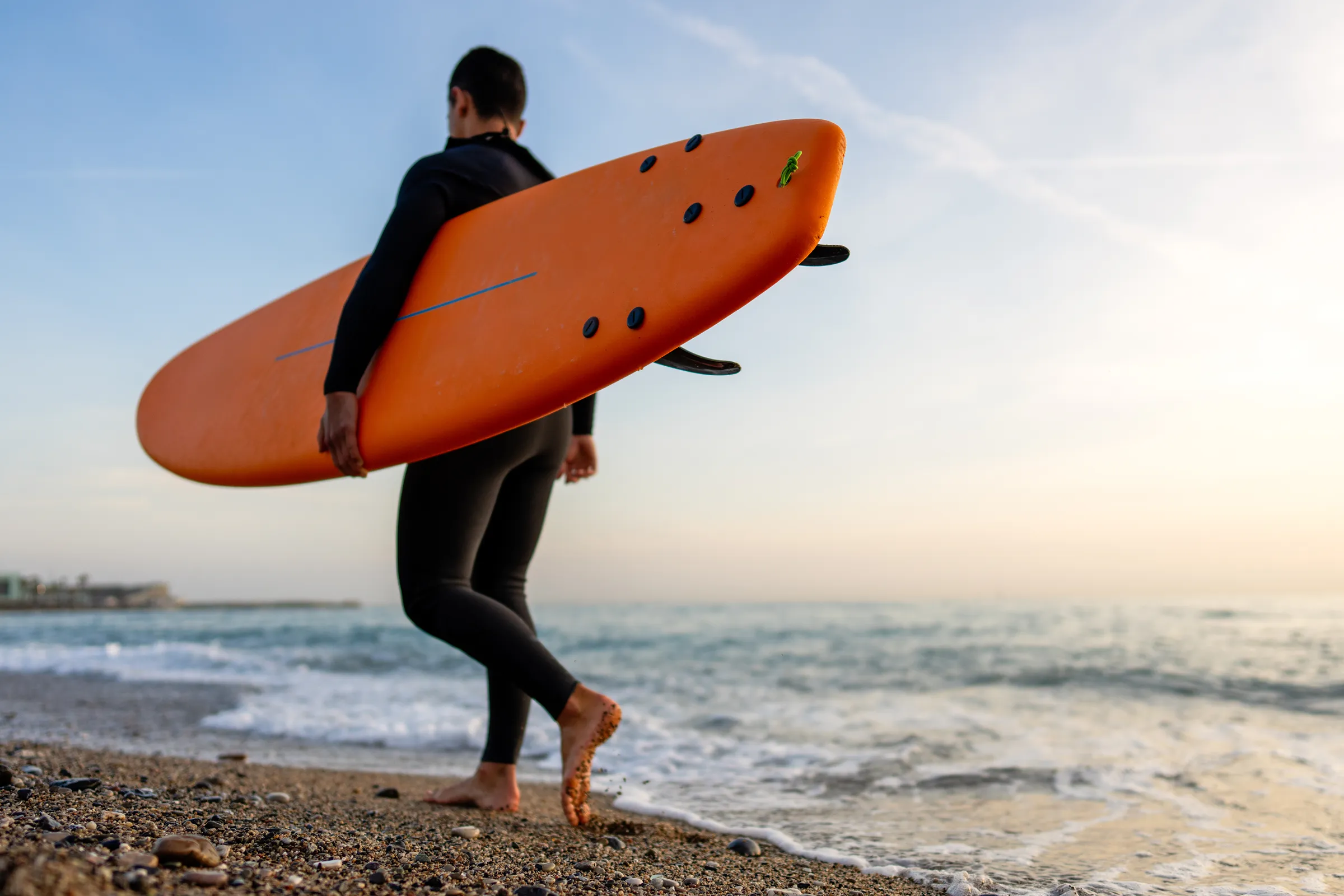
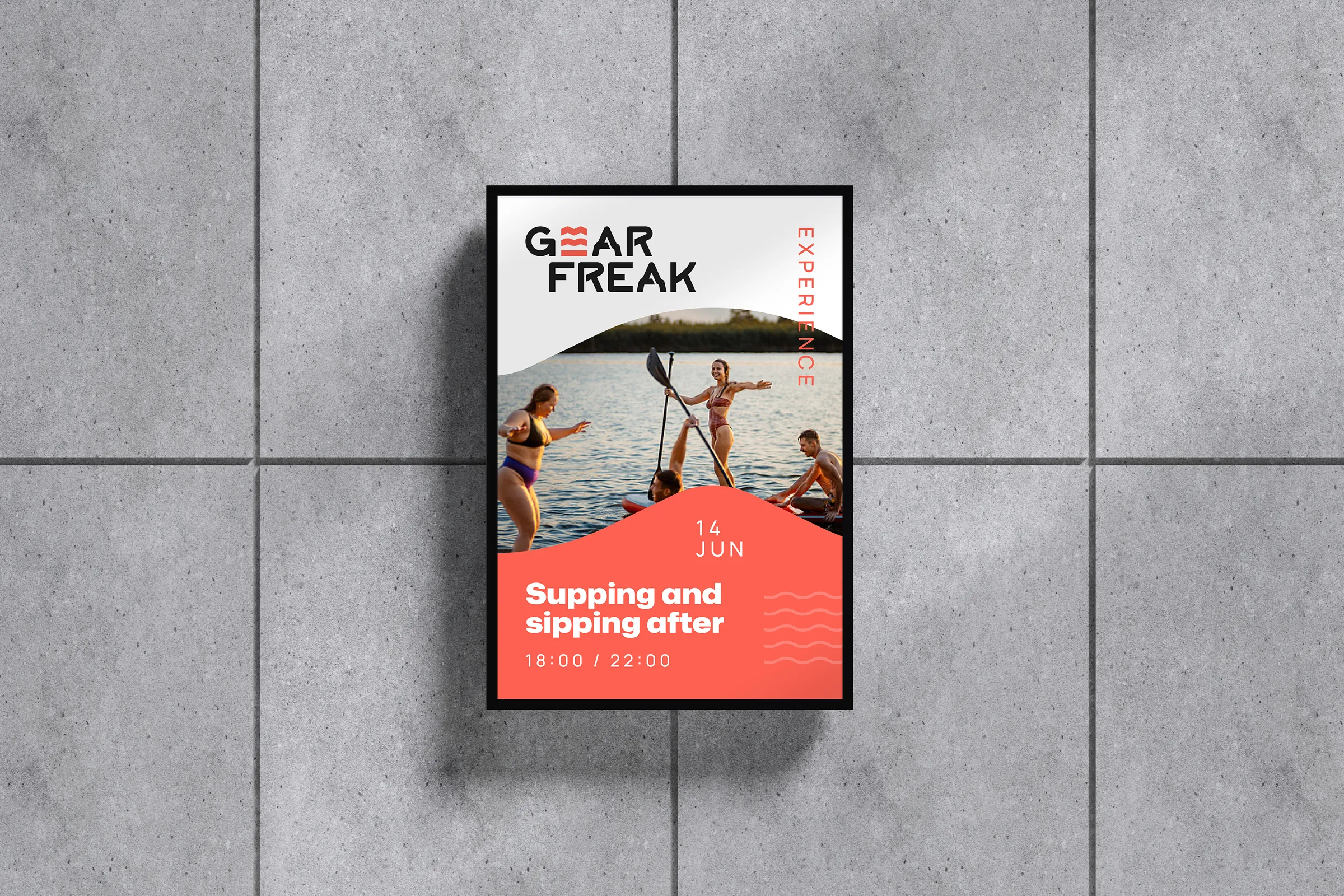
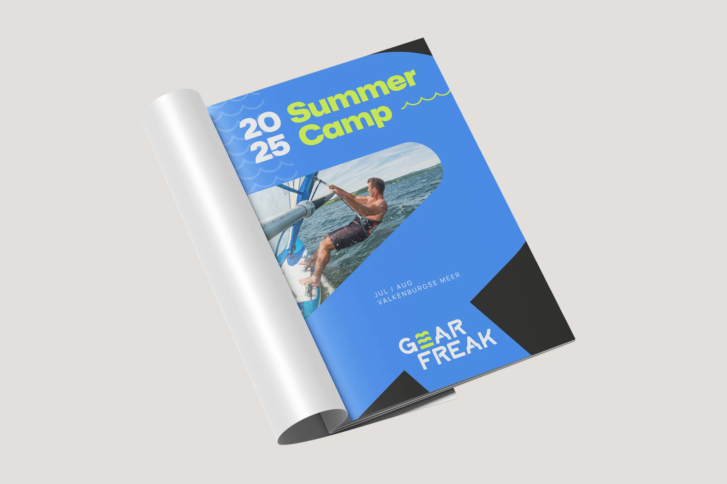
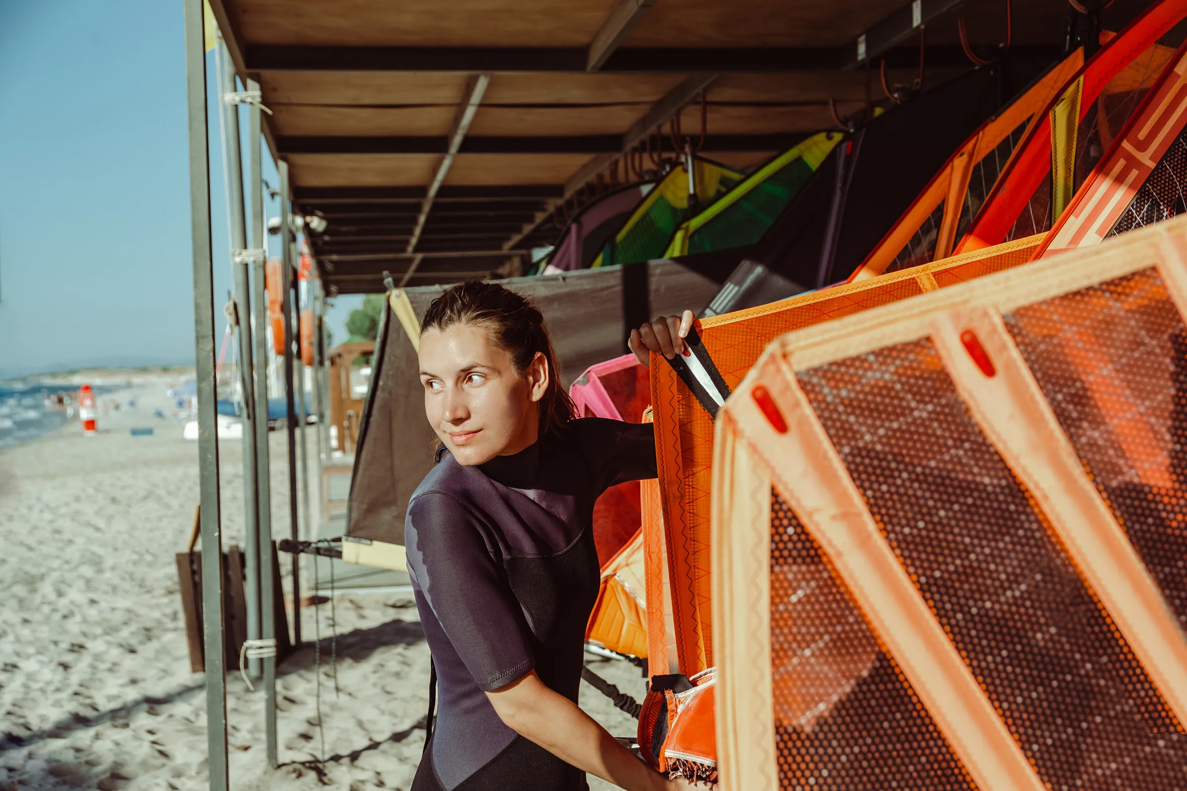
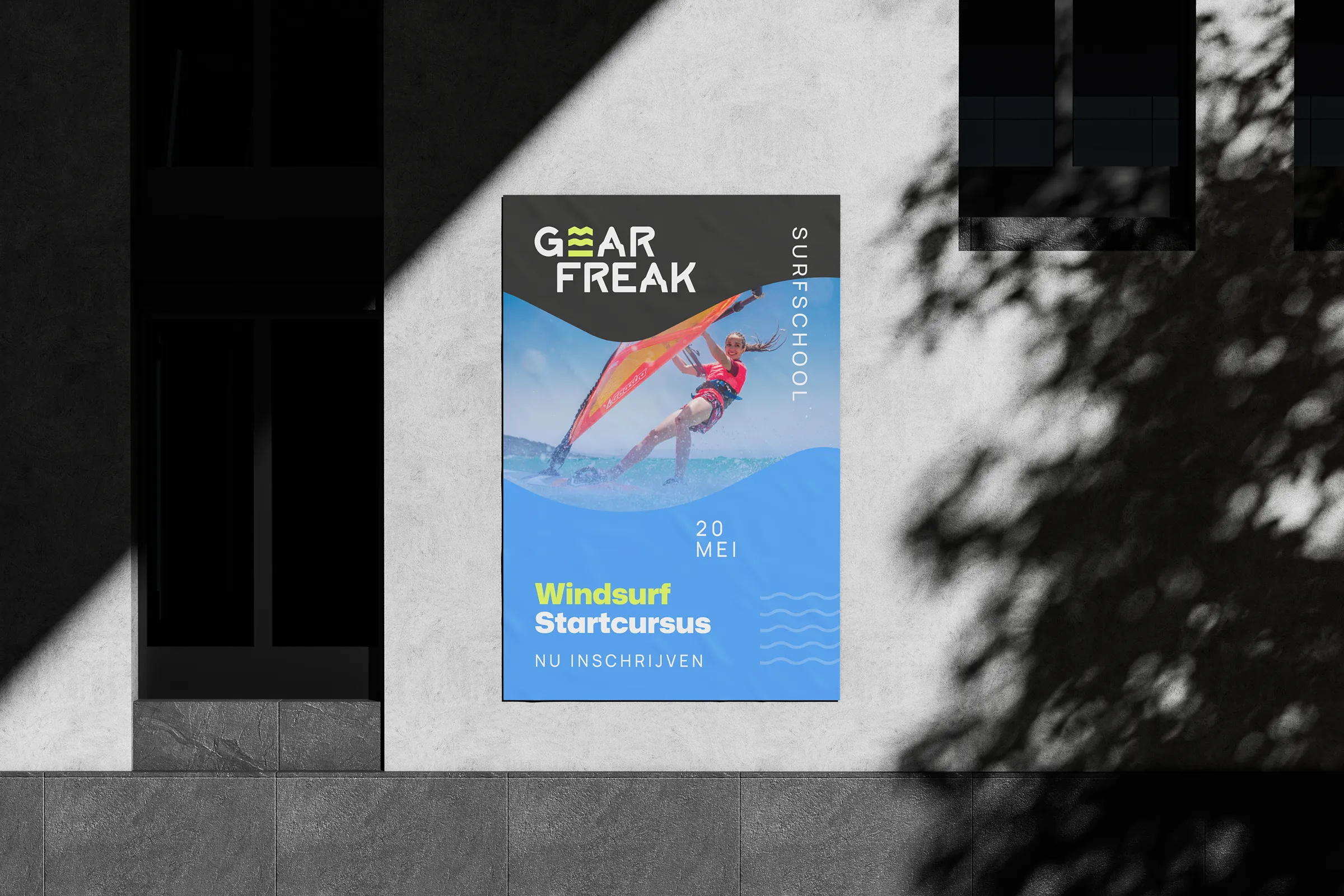
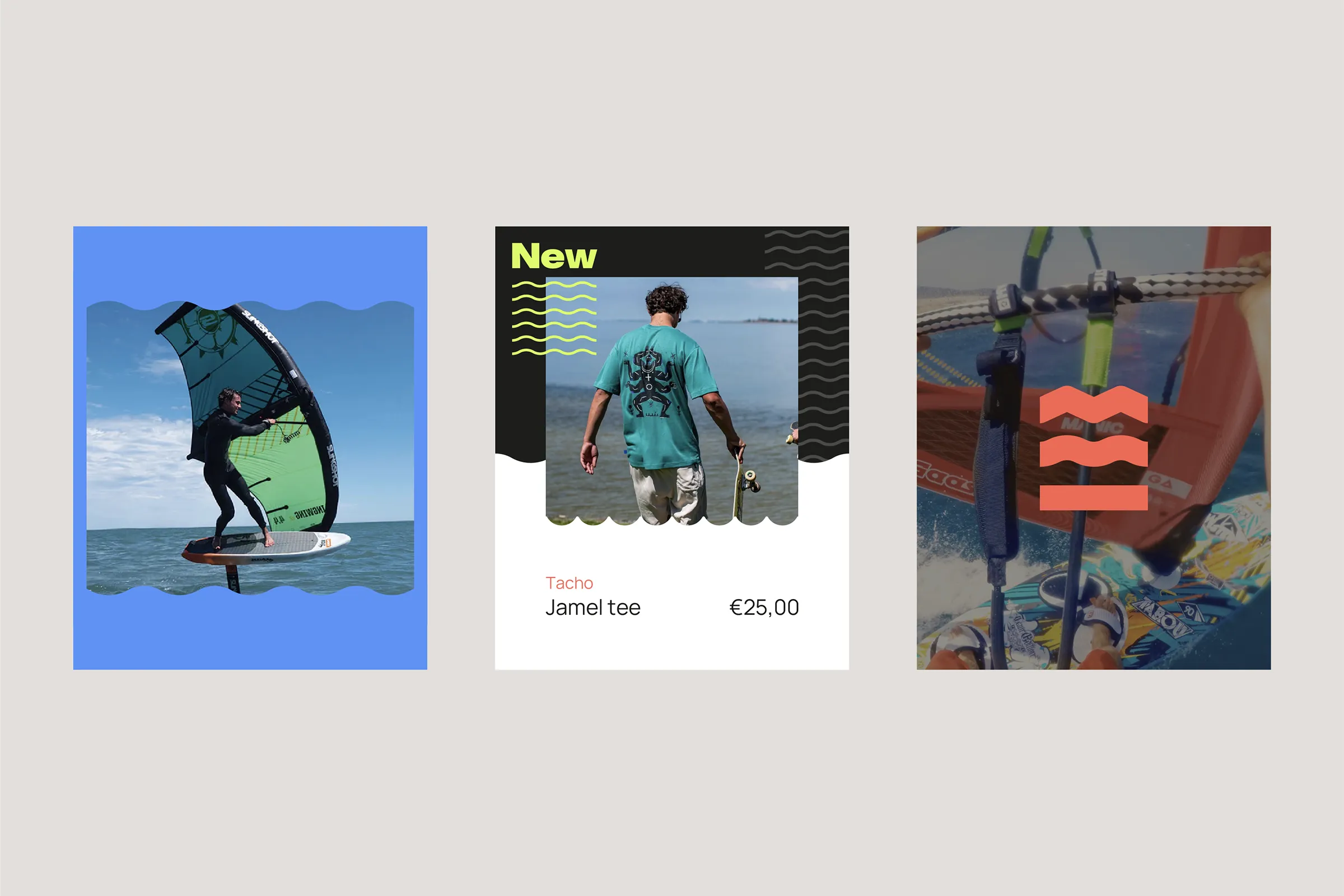
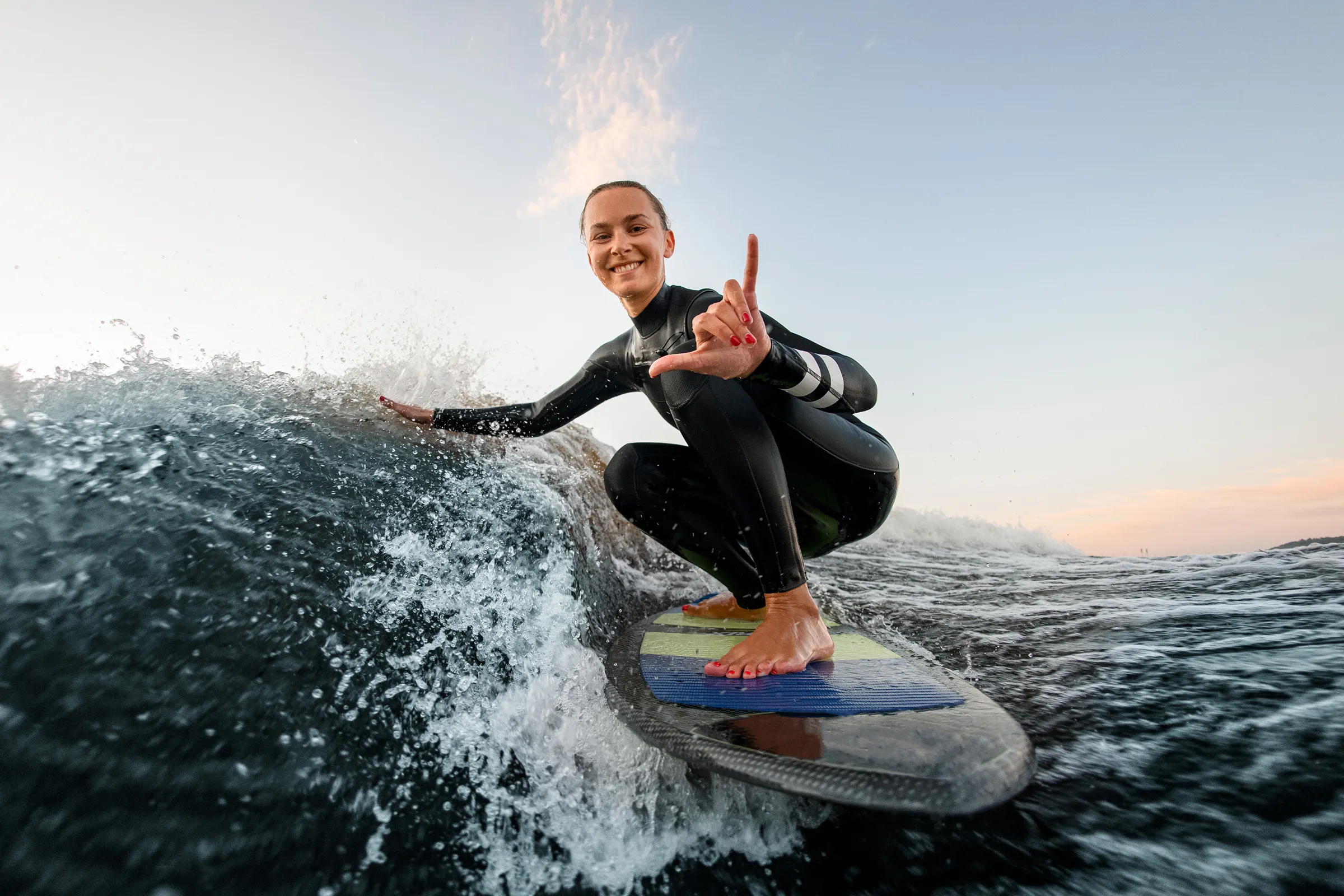
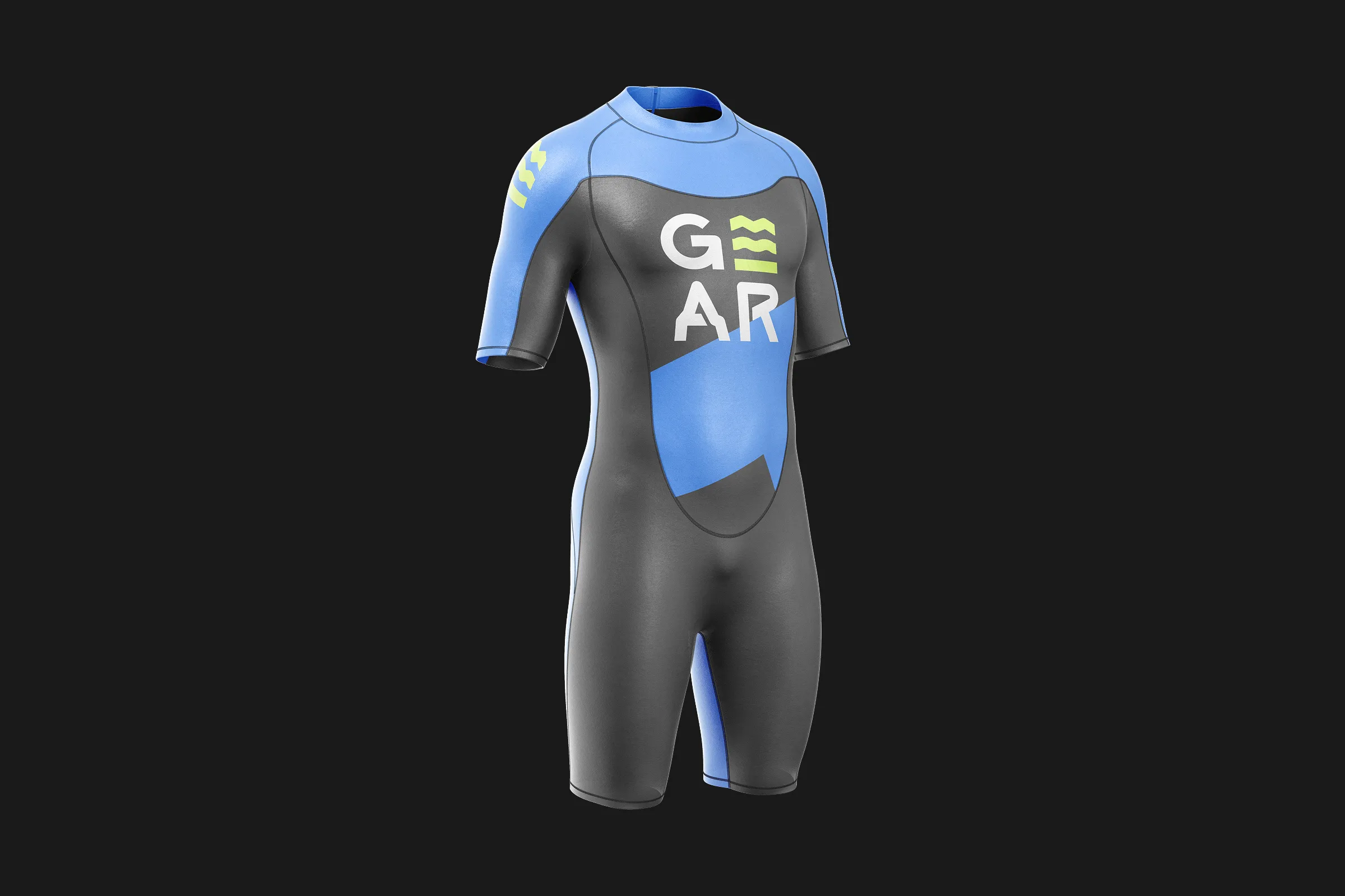
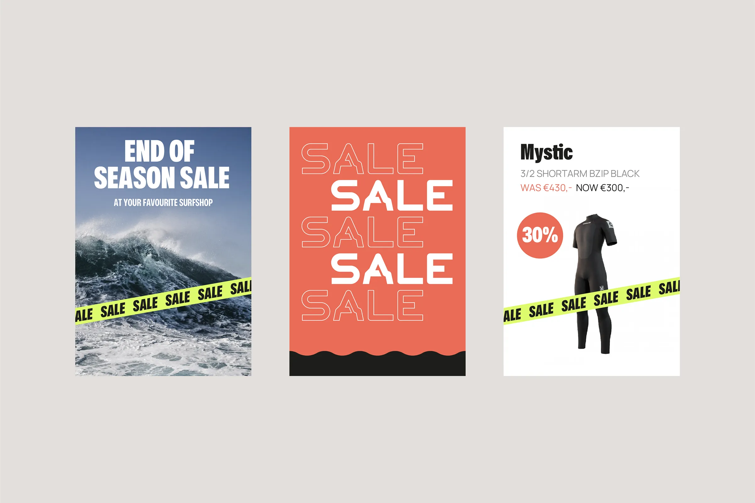
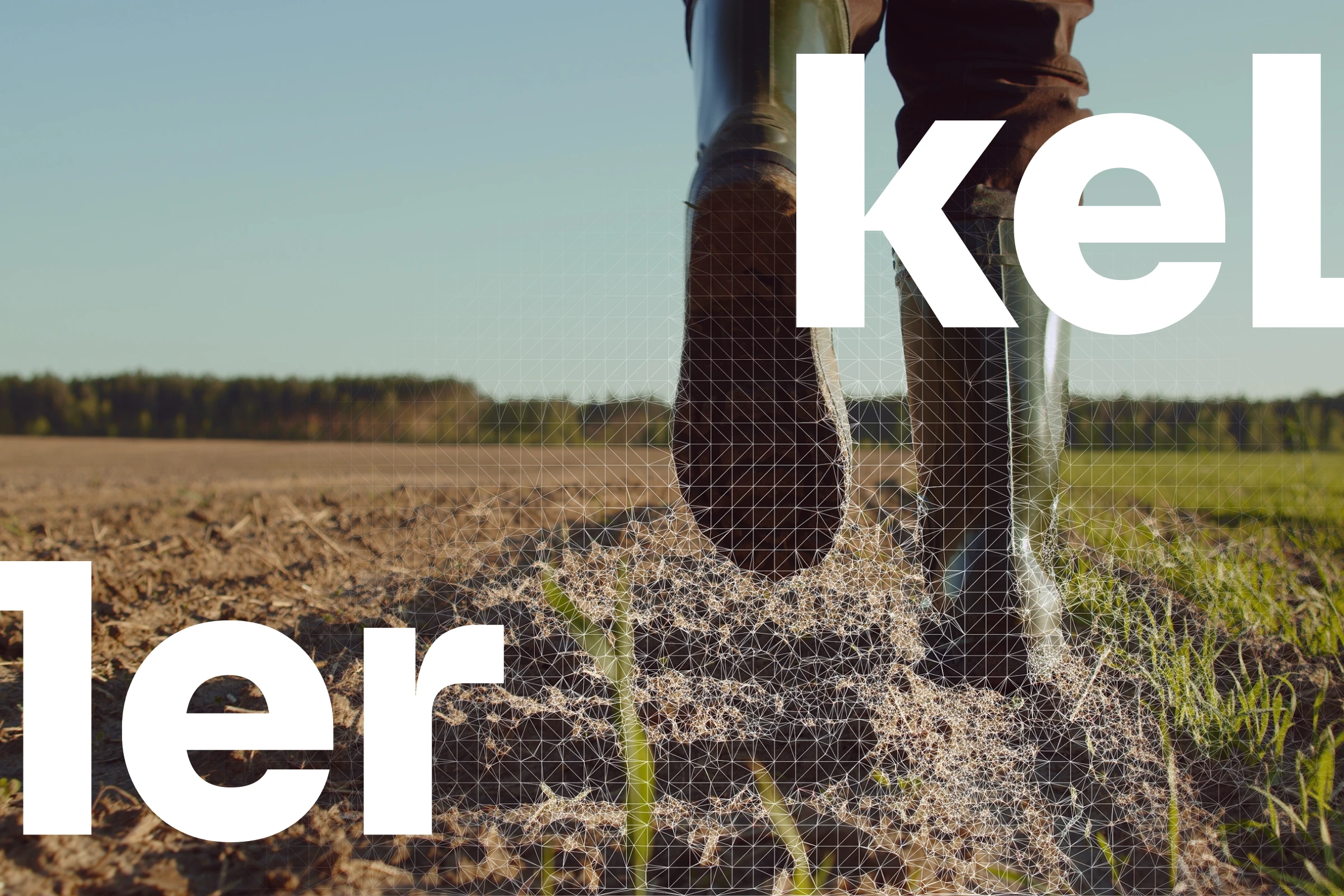
The new identity builds on the idea “Experience our expertise”—linking the team’s technical know-how to the thrill of wind, water, and snow. WADM developed a design system that balances professional confidence with human warmth: a clear tone of voice, bold typography (Mona Sans and Manrope), natural and energetic photography, and a modern color palette rooted in the outdoor experience. The refreshed visuals and messaging connect the webshop, shop floor, and surf clinics into one unified and recognizable brand experience.
RESULT
With a sharper story and consistent visual system, GearFreak now presents itself as a brand driven by expertise and enthusiasm. The renewed identity enhances both customer trust online and the sense of community in-store and during clinics. Supported by a tactical communication plan—covering website, social media, and on-location materials—the new GearFreak brand now stands stronger, clearer, and ready for growth.